Skip to content

Open the doors of a wardrobe a year after it was fitted and the interior tells its own story. Perhaps there are grey streaks where a boot toe has dragged along the base shelf, or a faint scuff on the side panel at the height of a handbag strap, or the inside looks dull compared with the surrounding room. These are the reasons the choice of interior finish matters on a drawing: the inside of a wardrobe takes knocks from shoes, hangers, and bags that the outer door faces are spared. The table below links each symptom to its cause and to the finish that shows it.
| Symptom | What causes it | Where it shows |
|---|---|---|
| Grey or black streaks on a base shelf | Rubber soles and heels leave a transfer mark when a shoe is slid in or out | Plain white shows a clear line; a wood-effect grain breaks it up |
| Pale scratch lines on a side panel | Zips, buckles and hanger hooks cut through the surface layer | Both, once the cut reaches the bare board beneath: a tan line on white, a paler line on a mid oak tone |
| Fingerprints and smears around drawer edges | Skin oils on a smooth surface | Stronger on smooth white than on a textured grain |
| Interior looks dim with the doors open | Dark surfaces take in the light that enters through the opening | Stronger with a mid or dark wood tone than with white |
| Interior clashes with the door colour | Warm and cool tones meeting at the door edge | Depends on the undertone of the oak-effect and of the paint |
How Each Finish Is Made and Why It Matters
An oak-effect interior is a woodgrain-effect laminate: a printed decorative paper sealed in hard resin and bonded to the board. The pattern sits within the surface, so a mark lands on a ground that already has light and dark streaks. A plain white interior has no pattern. It is a single flat tone, either a white laminate or a painted board, and the eye reads any disturbance on it at once.
Both finishes sit on the same carcass, and both are cut, edged, and fitted on the same schedule. The difference lies in how the surface handles marks and how it handles light, the two things you notice each morning when you open the doors.
Marks From Hangers, Shoes and Bags
Shoes cause the first marks. A rubber sole dragged across a shelf leaves a streak darker than the shelf itself. On white it stands out as a clean grey line against a clean ground. On an oak-effect finish, the streak crosses grain that is already varied, so the eye finds it harder to pick out. The streak is still there and wipes off the same way, but it takes a closer look to see it.
Hangers wear the rail and the shelf above it. A wire or metal hook rubs the top of the rail as the hangers slide along, and clothes brushing past the sides leave small abrasions at hanging height. A scratch that stays within the resin surface is hard to see on either finish. A scratch that cuts through to the board shows the tan core: on a mid or dark oak tone it reads as a paler line, on white as a darker one, so a deep scratch shows on both finishes. Neither finish wins on every kind of mark.
Bags are the third source. Zips, rivets, and metal feet drag along the base shelf and the lower sides. A bag foot pressed on a shelf and then slid leaves the strongest scuff, and a grain pattern with some relief disguises that scuff better than a smooth, plain tone.
Tip: Tell the designer which three items move in and out of the wardrobe daily, such as ankle boots, a rigid suitcase or a handbag with metal feet. The drawing can then place the hard-wearing shelves and drawer tops where those items land.
How Light the Inside Feels With the Doors Open
A wardrobe interior has no light of its own. Whatever reaches the clothes comes from the room through the open door and bounces off the shelves, the sides, and the back panel on its way to what you are looking for. White returns more of that light than a mid or dark wood tone does, which is why a white interior looks bright, and an oak-effect one looks warmer and a little dimmer.
Depth sharpens the effect. A deep wardrobe with shelves stacked one above another casts shade on each shelf below it, and the lowest shelves get the least light. In a section of that kind, white lifts the shade where oak-effect deepens it. A shallow wardrobe facing a large window loses little, and the warm tone of the oak-effect finish then reads as a quality of the room rather than a loss of light.
Dark clothes need a note of their own. Black and navy garments lose their outline against a deep tone, so if you hang mainly dark clothes, a lighter interior makes them easier to find. White does the reverse for white shirts and pale knitwear, which blend into the sides at a glance, and a wood tone gives them an edge to stand against.
Pairing the Interior With the Door Colour
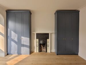
The door and the interior meet at the door edge each time a door opens, and the eye reads the two together. Painted shaker doors come in whatever colour the wall is painted, and the interior can echo that or answer it.
Warm interior, cool door: A deep blue, a green-grey or a charcoal looks calm beside warm oak-effect, because the two sit on opposite sides of the colour wheel and neither fights the other. A deep blue door over a warm oak-effect interior is a pairing that suits a painted shaker run.
White interior, any door: White is neutral, so it sits behind a painted door of any colour without a clash. The trade-off is that the door edge can look slightly flat against it, and a bright, cold white makes a warm cream door look yellowish.
Warm interior, warm door: A cream or a pale warm grey beside oak-effect can read as one temperature stacked on another. If the oak has a yellow cast, the cream door looks yellower beside it. In a room that is already warm, a cooler door or a neutral white interior takes the weight off.
Undertone decides the pairing, whatever the colour is called. Two finishes both called oak can lean yellow or lean grey, and two whites can lean blue or lean cream. A sample held against the painted door, not against the wall, settles the matter quickly.
Which Wears Better and Which Looks Brighter
For a household with children, a busy hallway or shoes that go in and out daily, the oak-effect interior hides the marks that arrive first: shoe streaks, smears and fine scuffs. It trades some brightness for that, and it suits a bedroom with good daylight. A white interior wins on light, on a clean, quiet look and on the way it flatters pale clothes, and it asks for more regular wiping.
Neither choice has to cover the whole wardrobe. A designer can propose different tones for different jobs, for example the wear-resistant wood effect on the base shelf and the shoe area where the marks fall, and white on the upper shelves where the light needs lifting. The drawing shows the combination before anything is cut.
Settling the Choice at the Design Visit
The cleanest way to decide is to see both finishes in your own room. Ask which interior finishes can be drawn up for your wardrobe, then look at a sample of each held inside the opening of your existing wardrobe or against the wall where the new one will go, at the hour you usually dress. How each finish handles your daylight, your bulbs and your door colour is something a catalogue picture cannot show.
An interior is chosen once and lived with for years, and the right one is the finish whose faults you can tolerate and whose strengths you will notice each morning.
Frequently Asked Questions
Two woods that are almost the same tone tend to look like a near miss, with the small difference drawing the eye. A floor and an interior that are clearly different in depth look deliberate. Hold a sample against the floorboards and judge the difference, not the match.
On a board with a coloured surface layer, a chip at an exposed edge can reveal the tan board beneath, and tan against white is easy to see. The same chip on a wood-effect edge blends into the pattern. Ask how the edges are finished on each option.
It can. New dark denim and dyed leather bags can leave colour on a light surface where they rest in damp or warm conditions. Wipe a fresh mark with a damp cloth as soon as you find it, and skip solvents, which can dull a laminate surface.
It does not have to. The back panel is the largest flat surface you face when the doors open, so a lighter tone there lifts the whole interior while the sides stay wood-effect. Ask the designer whether it can be drawn in a different tone from the sides.
Not unless the drawing specifies it. Woodgrain laminate has a direction, and a side panel may be cut with the grain running up while a shelf runs across. Ask for the grain direction to be marked on the drawing so the shelves read as one set with the sides.
Both take a damp cloth. On a textured wood effect, a smear sits in the grain, so a firmer pass along the grain direction lifts it where a circular wipe leaves it behind.
Bring a sample of your wall paint to a free design visit — the designer can hold each interior finish against it and show how the oak effect or white sits beside your door colour. Humphries Cabinets serves London. Call 020 4538 7044.