Skip to content

You’ve chosen your wardrobe style. You’ve sorted the interior layout. And now you’re staring at a paint chart, wondering whether to go with Cornforth White or just play it safe with brilliant white.
Paint colour is one of those decisions that feels minor until you get it wrong. The right shade makes your fitted wardrobes look like they’ve always been part of the room. The wrong one makes them look exactly like what they are — a box bolted to the wall.
The good news: because bespoke fitted wardrobes are built and painted entirely to your specification, you have complete control. This guide walks you through how to approach colour selection room by room — bedroom, living room, hallway, loft, and home office — so you can make the call with confidence.
Understanding Paint Finishes Before You Pick a Colour
The finish affects how a colour looks just as much as the colour itself. At Humphries Cabinets, fitted furniture is painted using one of two methods:
Hand painting — expertly applied by cutting in by hand and finishing with a roller for a smooth, high-quality result. All standard colours and finishes are available through hand painting.
Spray painting — the premium option, delivering a flawless finish across large door panels with multiple coats and meticulous sanding between each. The result is harder, more durable, and more consistent — particularly important on large wardrobe doors where any surface variation becomes visible. Available in satin or gloss.
For fitted wardrobes, spray painting is typically the better choice — especially if you’re going with a deeper or bolder colour, where surface imperfections would show far more clearly than on a pale neutral.
Satin vs gloss: Satin offers a subtle, elegant sheen that works well in most rooms. Gloss creates a more reflective, high-impact look best suited to modern and contemporary interiors. For period homes, satin almost always reads better.
Bedroom Wardrobes: Calm, Cohesive, and Built-In Looking
The bedroom is where most fitted wardrobes live, and colour here directly affects how restful the room feels. The goal in most bedrooms is cohesion — wardrobes that feel like part of the room, not furniture placed in front of it.
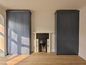
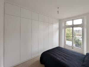
Match the wall colour — this is the most popular approach for good reason. When shaker-style wardrobe doors are painted the same colour as the surrounding walls, they create a subtle panelled effect that reads as architectural rather than decorative. The wardrobes essentially disappear into the room, which is exactly the effect most homeowners are after. This works beautifully in both light and darker tones.
Soft whites and off-whites — a consistently reliable choice. They make rooms feel bright and spacious, work alongside almost any bedding palette, and are particularly effective in smaller bedrooms or those that don’t get much natural light. Soft white and off-white tones in a warm hue tend to work better than stark brilliant white, particularly under artificial lighting.
Deeper statement colours
increasingly popular in larger bedrooms. A deep navy, forest green, or charcoal grey can look genuinely striking when the wardrobe spans a full wall, particularly when paired with warm oak interior finishes and simple bar handles. If the bedroom has good natural light, don’t be afraid of going bold.
Muted heritage tones
soft greens, warm greys, dusty blues, and pale sage work especially well in period properties (Victorian, Edwardian). They add depth without feeling heavy, and sit beautifully alongside natural wood wardrobe interiors in oak or walnut. Muted heritage tones such as soft greens, warm greys, dusty blues, and pale sage add depth without feeling heavy.
One mistake to avoid
choosing a colour in isolation. Always look at paint samples on the actual wardrobe door or on a large piece of card in the room, in both natural and artificial light, before committing.
👉 See our fitted wardrobe range and wardrobe interiors for design inspiration.
Living Room Units: Alcoves, Shelving & Media Units
In living rooms, fitted furniture usually means alcove units, built-in shelving, media units, or bookcases. These pieces are seen from multiple angles throughout the day — colour choices need to work harder here than in a bedroom.
Matching the walls for an architectural feel — painting alcove units or shelving the same colour as the surrounding walls is one of the most effective design moves in any living room. It shifts attention from the furniture itself to what’s displayed on the shelves. The room feels designed rather than furnished.
White and light neutrals in bright rooms — in living rooms with strong natural light, lighter tones prevent fitted furniture from dominating the space. They also give you maximum flexibility to change soft furnishings, rugs, and accent colours over time without the fitted furniture feeling dated.
Contrasting deeper tones in alcoves — painting alcove cupboards a shade darker than the surrounding walls creates a sense of depth and deliberate design. A warm charcoal, deep sage, or navy in the alcoves, with lighter walls around them, draws the eye to the alcoves as a feature rather than treating them purely as storage. This is one of the most searched-for living room looks right now.
👉 Browse our alcove units and living room shelving, and entertainment units for recent project examples.
Hallway Storage: First Impressions Matter
Hallways set the tone for the entire home — and in London properties, they’re also one of the most commonly wasted spaces. Without properly fitted storage, a hallway becomes a dumping ground within weeks of moving in. With it, it becomes one of the most practical rooms in the house.
Lighter colours in narrow or darker hallways — soft whites, light greys, and pale neutrals are the safest choice in hallways that don’t get much natural light. They reflect whatever light is available and prevent the space from feeling enclosed or oppressive.
Match the existing woodwork — skirting boards, door frames, and architraves already set the tone for the hallway. Painting fitted cupboards and storage to match or closely complement these elements makes everything feel considered and intentional. In period properties, particularly, this continuity is important to the overall character of the entrance.
Gloss finish for modern hallways — a sleek, full-gloss finish in a light or mid-tone works beautifully in contemporary hallways. It reflects light, gives fitted units a polished appearance, and complements handleless door designs and push-shut mechanisms particularly well.
👉 See our hallway wardrobe and storage solutions for ideas.
Loft Room Wardrobes: Working With Angles and Awkward Proportions
Loft rooms are their own design challenge. Angled ceilings, sloped eave walls, and lower ceiling heights at the edges all affect how colour behaves in the space — and how fitted wardrobes integrate with the room around them.
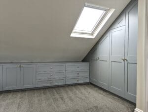
Paint wardrobes the same colour as the walls and ceiling — this is the single most effective approach in a loft room. Rather than treating the wardrobes as separate furniture, a unified colour across all surfaces — walls, ceiling, and wardrobe fronts — makes the fitted pieces feel genuinely built into the architecture of the room. The awkward angles become a feature rather than a problem.
Crisp whites and warm neutrals for light-limited lofts — loft rooms with smaller or roof-level windows can feel dark, especially at the eaves. Lighter tones keep the space feeling open and airy despite the constraints. Warm whites (rather than stark brilliant white) tend to work better in these spaces, avoiding the clinical feel that cool whites can create under artificial light.
Deeper tones in larger, well-lit lofts — if the loft has good natural light and the wardrobe spans a full wall, a deeper colour can add genuine presence. It anchors what might otherwise feel like an odd or unfinished wall and gives the room a more complete, considered feel.
👉 See our loft wardrobe designs and loft eave units for examples of how we handle these spaces.
Home Office Storage: Calm, Focused, Functional
Home office fitted furniture — desks, shelving, and storage units — needs to support concentration rather than compete with it. Colour choices here are typically more restrained, with practicality leading the way.
Neutral tones — soft whites, warm greys, and light stone shades are the most reliable choice. They create a clean, professional backdrop that works alongside screens, documents, and books without adding visual distraction. In a room where you spend hours looking at the same four walls, calm is an asset.
Natural oak finishes — Humphries Cabinets offers real oak with a hand-varnished clear satin resin finish, and it’s particularly well-suited to home offices and studies. The warm, rich tones of natural oak give the space a sense of quality and permanence that painted finishes don’t always achieve in a working environment.
Deeper colours with good task lighting — in a larger, well-lit home office, a deep navy or forest green fitted desk and shelving unit can feel focused and grounding. It’s a look that’s grown significantly in popularity for home studies and is worth considering if you want the room to feel more like a dedicated workspace than a spare room with a desk in it.
👉 See our built-in office desks and home office storage for ideas.
6 Principles That Apply in Every Room
2. Consider the room's natural light first
Rooms with limited natural light need lighter colours to avoid feeling heavy. Rooms with large windows or south-facing aspects can handle a much wider range of tones, including deeper shades that would feel oppressive elsewhere.
1. Always test in the actual room
Paint colours change dramatically depending on the light in a specific room. What looks perfect on a chart or in a showroom can read completely differently on your wardrobe doors. Get a large sample and live with it for a few days in both natural and artificial light before committing.
4. Think about door style
Shaker and panelled doors carry colour differently from plain slab doors. The recessed panels create shadow and depth, which makes both light and dark tones more visually interesting. A flat slab door in the same colour reads more uniformly, which can be striking in the right context but less forgiving in others.
3. Look at the existing woodwork
Skirting boards, door frames, cornicing, and architraves all influence how a wardrobe colour reads in the room. Matching or thoughtfully complementing these elements is what separates fitted furniture that feels considered from furniture that feels placed.
6. Finish matters as much as colour
A spray-painted satin finish and a hand-painted matt finish in the same colour will look noticeably different on large wardrobe doors. Make sure the finish you choose suits both the colour and the room.
5. Choose for the long term
Bespoke fitted furniture is a lasting investment. A timeless tone in a quality finish will still look right in fifteen years. A highly trend-specific colour might not survive a single redecoration.
FAQ: Paint Colours for Fitted Wardrobes
Should fitted wardrobes be the same colour as the walls?
It’s one of the most popular approaches — and for good reason. Matching the wall colour makes wardrobes feel architectural and seamless rather than furniture-like. It works particularly well with shaker-style doors. That said, a contrasting colour can also be very effective if you want the wardrobe to be a feature in its own right.
What is the most popular colour for fitted wardrobes in the UK?
Soft whites and off-whites remain the most widely chosen colours for fitted wardrobes, followed by warm greys and muted heritage tones such as sage green, dusty blue, and stone. Deep statement colours like navy and forest green are increasingly popular in larger bedrooms.
Satin or gloss finish for wardrobes — which is better?
For most rooms, satin is the better choice — it’s elegant, less demanding to maintain, and works well in both period and contemporary interiors. Gloss works well in modern hallways and contemporary bedrooms where a more reflective, high-impact look is the goal.
Can I change the colour of my fitted wardrobes after installation?
Yes, though it’s worth getting it right the first time. Spray-painted finishes can be repainted, but the process requires proper preparation to achieve a quality result. Your installer or a specialist painter should be consulted before attempting to repaint fitted furniture.
What paint colours work best in a dark bedroom?
Soft whites, warm off-whites, and light warm neutrals work hardest in bedrooms with limited natural light. Avoid cool whites, which can feel stark under artificial lighting. If you want to use a slightly deeper tone, warm greys or pale sage tend to hold up better than cooler shades in low-light rooms.
Do Humphries Cabinets match specific paint brands?
Yes — the team can work with specific colours from brands including Farrow & Ball, Little Greene, Dulux, and others. The design consultation is the best time to discuss your preferred colours and how they’ll work with your chosen door style and interior finish.
Book a Free Design Consultation with Humphries Cabinets
Colour is one of the most visible decisions in any fitted wardrobe project — and one of the most personal. Getting it right is the difference between wardrobes that feel like an afterthought and wardrobes that feel like they were always meant to be there.
At Humphries Cabinets, the design process covers every detail — from the initial measurements and 3D drawings through to door style, interior layout, hardware, and paint finish. Whether you’re drawn to a classic soft white shaker wardrobe or something more distinctive, the design consultation is where it all comes together.
👉 View our bespoke fitted wardrobe range — or book a free design visit and we’ll come to you.
Also, explore our portfolio to see how recent projects have come together across a range of styles, colours, and room types.